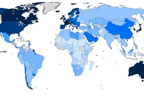
Gdp Nominal Per Capita World Map Imf 2007
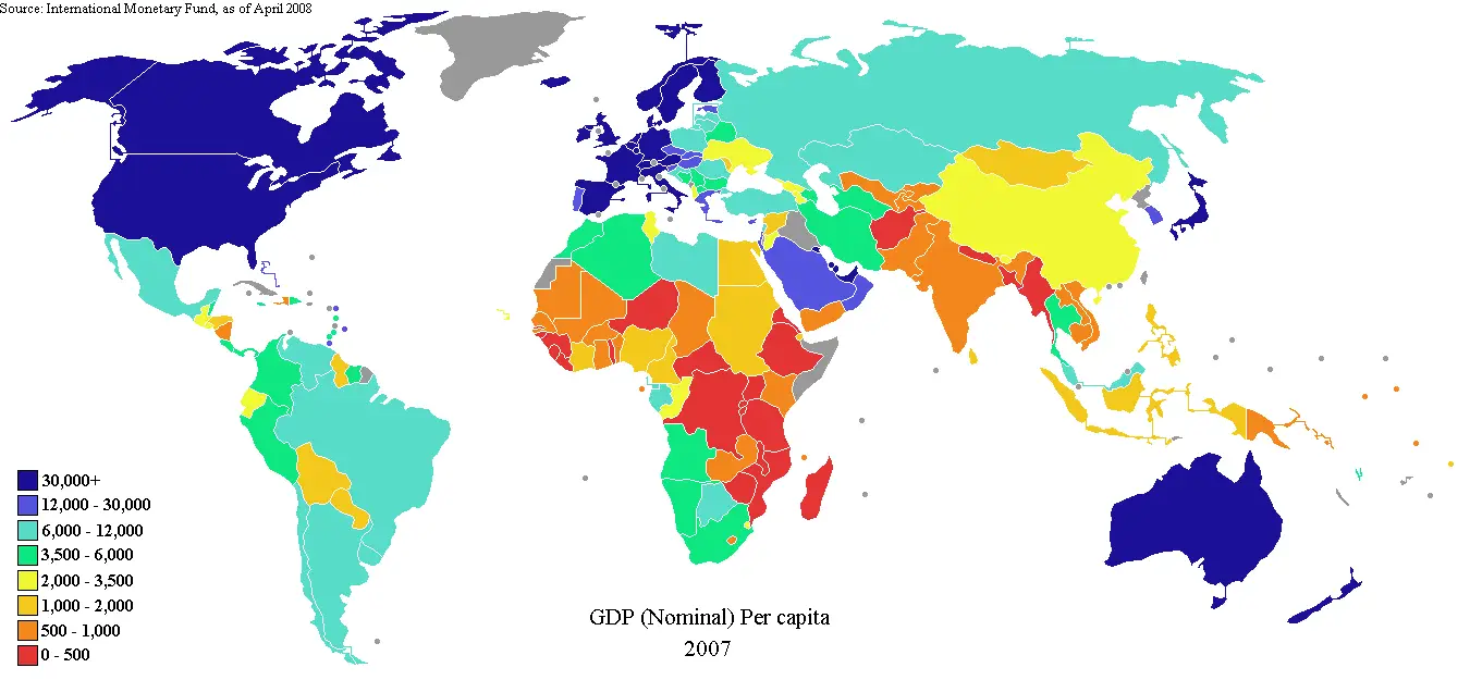
Click or tap the map to enlarge it.
GDP Nominal Per Capita World Map IMF 2007
Key Takeaways
- The GDP Nominal Per Capita World Map IMF 2007 provides a visual representation of the economic prosperity of countries based on their Gross Domestic Product (GDP) per capita.
- This map allows for a quick understanding of the relative wealth of different nations and regions.
- GDP per capita is an important indicator of a country’s standard of living and economic development.
- The map is based on data from the International Monetary Fund (IMF) in 2007.
History
The GDP Nominal Per Capita World Map IMF 2007 is a result of extensive research and analysis of economic data. The International Monetary Fund (IMF) collects and provides information on countries’ GDP and population, and this specific map focuses on GDP per capita.
GDP per capita is calculated by dividing a country’s Gross Domestic Product (GDP) by its population. It is a widely used economic indicator that reflects the average income or wealth per person in a given country.
The data used for this map is from the year 2007, which was a significant period of economic growth and development for many countries around the world. This map provides a snapshot of the relative wealth of nations during that time.
Unique Insights
- The GDP Nominal Per Capita World Map IMF 2007 reveals interesting patterns and trends in global economic development. For example:
- High-income countries, such as Luxembourg, Qatar, and Switzerland, stand out as the wealthiest nations with the highest GDP per capita.
- North America and Western Europe generally have high GDP per capita, reflecting their advanced economies.
- Latin American and African countries, in general, have lower GDP per capita, indicating lower economic development.
- There are significant disparities in economic prosperity between regions and even neighboring countries.
- The map highlights the importance of factors such as natural resources, political stability, and economic policies in determining a country’s wealth.
Table of Relevant Facts – Economic Indicators in 2007
| Country | GDP per Capita (in USD) | Population (in millions) |
|---|---|---|
| United States | 48,381 | 301.2 |
| China | 2,485 | 1,314.5 |
| India | 1,018 | 1,162.0 |
| Japan | 34,605 | 127.8 |
Frequently Asked Questions (FAQ)
Q: What is GDP per capita?
A: GDP per capita is a measure of a country’s economic output per individual. It is calculated by dividing the Gross Domestic Product (GDP) of a nation by its population size.
Q: How is GDP per capita related to a country’s standard of living?
A: GDP per capita provides an indication of the average income or wealth enjoyed by people in a particular country. Higher GDP per capita generally suggests a higher standard of living.
Q: Why is Luxembourg one of the wealthiest countries according to the map?
A: Luxembourg’s high GDP per capita is largely attributed to its robust financial sector, favorable tax policies, and a small population. These factors contribute to its overall economic prosperity.
Q: Are there any limitations to using a map to represent economic data?
A: Maps provide a visual representation of data, but it is important to remember that they can oversimplify complex economic dynamics. GDP per capita alone does not capture the complete picture of a country’s economic situation or inequality.
Q: How often is the GDP data updated?
A: GDP data is typically updated annually or quarterly by organizations such as the International Monetary Fund (IMF) or national statistical agencies. However, the availability of data may vary by country.
Q: Can GDP per capita alone determine a country’s economic well-being?
A: While GDP per capita is a widely used indicator, it should be considered alongside other factors such as income distribution, poverty rates, and social indicators to have a comprehensive understanding of a country’s economic well-being.
Q: How can I access the complete map and additional data?
A: For the complete map and additional data on GDP per capita, you can visit the International Monetary Fund’s website or refer to economic databases that provide access to such information.