Prevailing World Religions Map
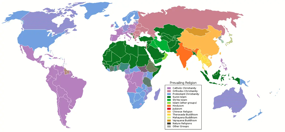
Click or tap the map to enlarge it.
This world map assigns each country to the religion followed by most of its people, using colours for Christianity, Islam, Hinduism, Buddhism, folk religions and non-religious populations. It is the simplest way to see the global geography of belief.
Such a map shows the majority religion only, so it hides large minorities and differences within countries, such as the many religions found in India, China or Nigeria.
Global shares of religion
According to the Pew Research Center's estimate for 2015, Christians made up about 31 per cent of the world's population and Muslims about 24 per cent. People with no religious affiliation accounted for around 16 per cent, Hindus 15 per cent and Buddhists 7 per cent. Folk religions and other faiths made up most of the rest.
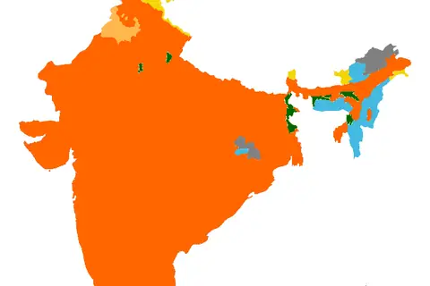
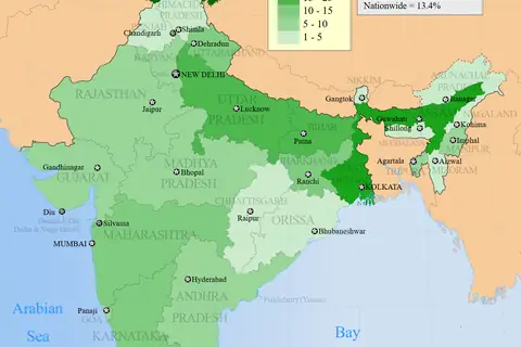
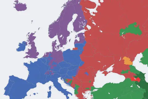
Christianity is the majority religion across Europe, the Americas, sub-Saharan Africa and Oceania. Islam dominates North Africa, the Middle East, Central Asia and parts of South and Southeast Asia, while Hinduism is concentrated in India and Nepal.
Limits of a majority map
A country is coloured by its largest group even if that group is only a plurality. Countries with major minorities, such as Nigeria or Lebanon, are shown as if they were uniform. Some regions, including China and Japan, mix several traditions that do not fit one label, and census categories vary between countries. Use the map as a starting point and look to national statistics for detail.
Key facts
| Group | Share of world population |
|---|---|
| Christians | About 31% |
| Muslims | About 24% |
| Unaffiliated | About 16% |
| Hindus | About 15% |
| Buddhists | About 7% |
Questions about this map
Which religion has the most followers?
Christianity, followed by Islam.
Where do the figures come from?
They are Pew Research Center estimates for 2015.
Why do some countries appear to be uniform?
A prevailing-religion map colours each country by its largest group.